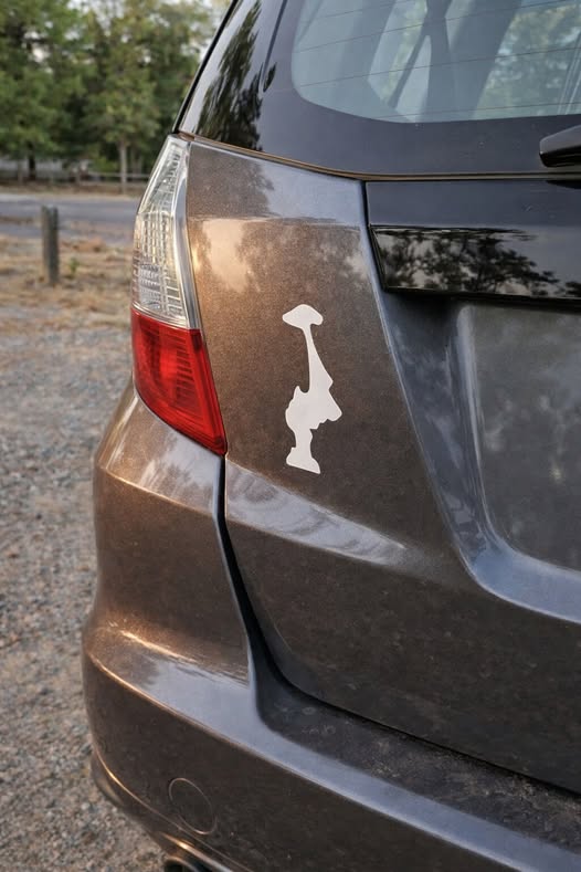
If you’ve ever spent time driving through the Pacific Northwest, you may have noticed a curious symbol appearing almost everywhere—on car bumpers, reusable water bottles, laptop covers, and even trail gear. It’s the outline of Washington state, but with one unusual detail: it’s displayed upside down. At first glance, it might seem like a printing mistake or a quirky design experiment. Yet the more often you encounter it, the more obvious it becomes that the inverted shape is entirely intentional. Over the years, this simple flipped outline has transformed into a subtle cultural emblem—one that quietly represents local pride, humor, creativity, and a deep connection to the Pacific Northwest lifestyle.
The trend first gained momentum in the early 2010s, during the rise of minimalist state-outline stickers that spread across the United States. These designs were simple, clean, and easy to recognize, allowing people to show love for their home states in a modern and understated way. Washington’s shape, with its bold rectangular form and distinct coastline, proved especially memorable. Even when turned upside down, the state remained instantly recognizable. What began as a playful design twist soon evolved into something much more meaningful.
Unlike loud slogans or flashy graphics, the upside-down Washington outline carried a quieter kind of identity. It became popular among outdoor adventurers, students, artists, travelers, and locals who appreciated the region’s unique culture and natural beauty. The design started appearing at coffee shops, college campuses, hiking trails, breweries, and farmers markets throughout the state. For many residents, it felt authentic to the Pacific Northwest spirit—creative, relaxed, and intentionally low-key.
Part of the symbol’s appeal comes from the many interpretations people attach to it. One humorous explanation points to Washington’s famously rainy weather. Locals often joke that the endless drizzle has somehow “flipped” the state upside down. Others view it as a subtle way to express hometown pride without being overly obvious or boastful. In a region known for its reserved personality and understated culture, the inverted outline feels perfectly fitting—recognizable to insiders while still mysterious to outsiders.
Some people also see a deeper connection to the landscape itself. When inverted, the state’s outline can resemble a rugged mountain peak, echoing the dramatic scenery that defines Washington. Towering landmarks like Mount Rainier, the Cascade Range, evergreen forests, rocky coastlines, and mist-covered valleys all play a major role in shaping the identity of the region. For residents who spend weekends hiking, skiing, kayaking, or exploring the outdoors, the upside-down design becomes more than just a sticker—it reflects a lifestyle centered around nature, adventure, and appreciation for the environment.
Today, the upside-down Washington symbol represents far more than a simple graphic trend. It has become a quiet badge of belonging for people who feel deeply connected to the Pacific Northwest. It captures the region’s balance of individuality and humility, creativity and simplicity. For longtime locals, it can symbolize home, community, and shared experiences. For those who move away, seeing the sticker often sparks nostalgia—bringing back memories of rain-soaked streets, dense evergreen forests, mountain views, ferry rides, and the calm beauty that makes Washington feel unlike anywhere else.
In many ways, the upside-down outline perfectly reflects the personality of the Pacific Northwest itself: unconventional, understated, slightly mysterious, and proudly different. What may appear at first to be an accidental design choice has quietly evolved into a modern cultural icon—one small symbol carrying a surprisingly deep sense of identity, place, and connection.