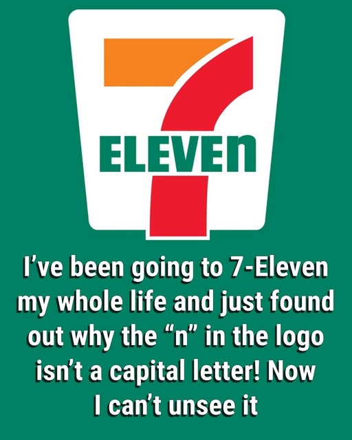
Convenience is something you rarely notice—until it suddenly refuses to let you look away. Think about the next time you pass by a 7‑Eleven. That glowing red, orange, and green sign has probably drifted past your eyes countless times, blending into the background of your daily commute. But then, one day, something snaps. Your brain latches onto a detail you’ve never consciously registered before: the last letter of “Eleven” is lowercase. That tiny “n” seems out of place. It doesn’t just look different—it feels deliberate, almost like a secret someone left for only the observant to find. And yet, it isn’t a mistake, a hidden code, or a printing error. It’s something far more subtle and human.
Most people would breeze past it without a second thought, but once you notice that lowercase “n,” it refuses to leave your mind. It raises questions: Why here? Why now? What does it mean? The answer lies in a small, almost invisible tweak that transformed an entire brand. Back when the convenience store chain was still called Tote’m Stores, the logo was simple, functional, and bold. But when the company rebranded to 7‑Eleven, adopting the vivid tri-color palette we recognize today, the word “ELEVEN” was originally rendered in all caps. It looked strong, authoritative, commanding even—but it also felt cold, impersonal, and a touch intimidating.
Enter an idea so modest it almost sounds like folklore: according to company history, the president’s wife suggested lowering the final “N” in “ELEVEN.” Just that—one letter, subtly shifted down—to make the logo feel warmer, friendlier, more approachable. The change stuck, and decades later, that tiny lowercase “n” still does the heavy lifting. It softens the towering “7” above it, eases the rigidity of all-caps letters, and injects a human touch into an otherwise corporate symbol.
In a world where design often strives for perfection, the lowercase “n” is a reminder that imperfection can be memorable. It’s a quirk so small that most people miss it, yet so effective that it quietly makes the brand feel inviting, relatable, and even a little charming. One tiny letter, almost invisible, helped transform a simple convenience store sign into a lasting icon, proving that sometimes the smallest details leave the biggest impression.